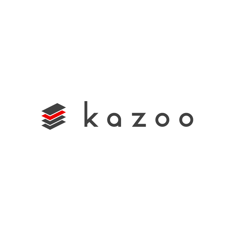
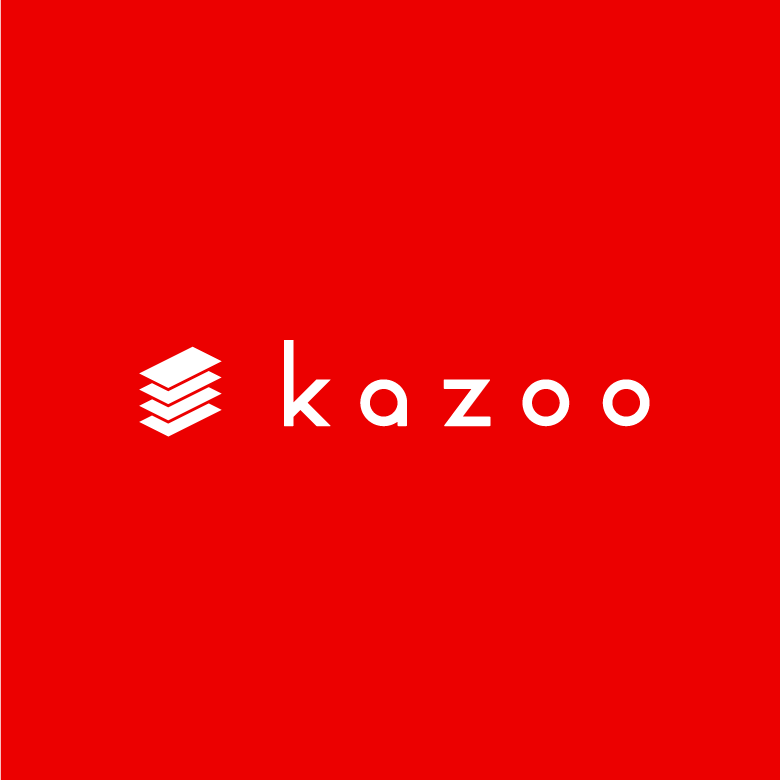
Kazoo Rebrand
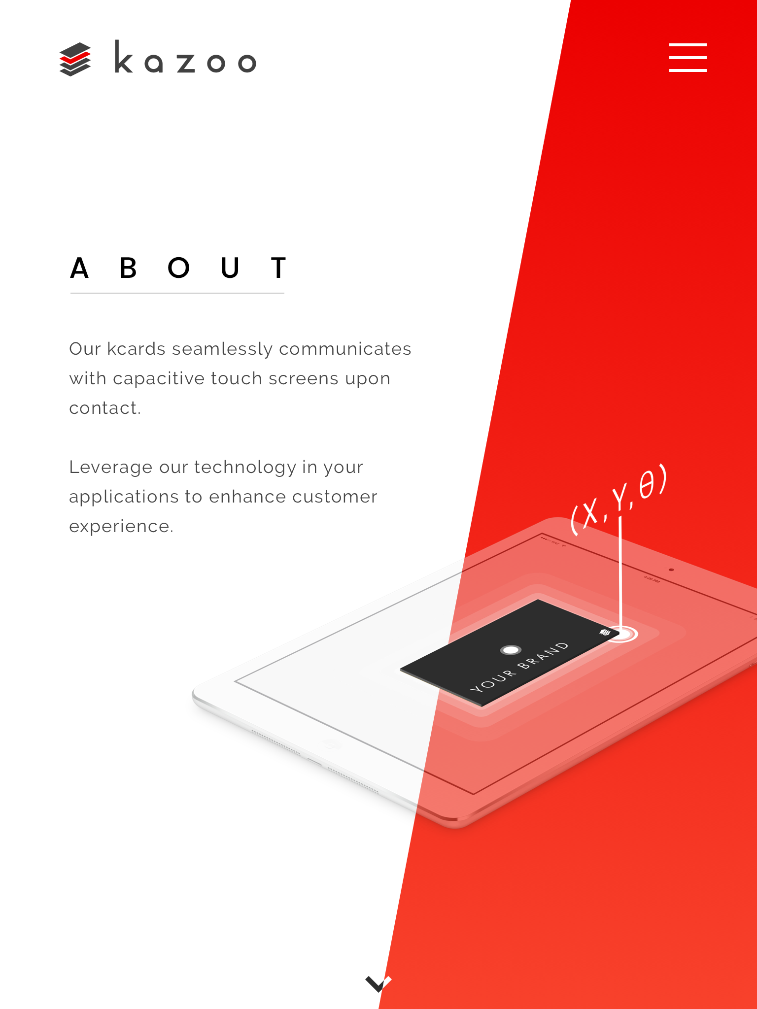
The goal was to give Kazoo, which specializes in B2B smart cards, an identity which can co-exist with partner clients. By using a four card-stack as its logo, the purpose of Kazoo’s product is subconsciouslly embedded into users. Furthermore, the colour palette of the card-stack logo is malleable to conform to partner clients’ branding.
identity

website
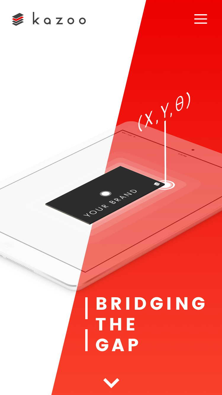
You can view the website here.